CSS Specificity is a Rat-Hole
A WordCamp STL presentation by
Drew Bell
This talk owes a ton to the work of
Nicole Sullivan,
Harry Roberts,
Sandi Metz,
and
Martin Fowler. Go, read, learn!
First, some disclaimers:
I sympathize with your constraints.
I think a lot of us get defensive when someone gives us suggestions
about our own workflow. “That’s fine for some guy giving a
talk, but in the real world I have deadlines! Once I get sign-off,
I’ll never see this again!” Well, I sympathize. Everything
I’m suggesting today is secondary to your own comfort in meeting
deadlines and getting paid. Now, part of my argument is that these
changes will make it easier to make deadlines in the future,
but overall we’re talking about
Heuristics, not prescriptions.
These are rules of thumb. Try them out, but use your own judgment. If
you find edge cases where anything I suggest is a bad idea, by all
means let me know!
Specificity is kinda hard to say aloud.
So I give you a free pass to read it to yourself as
spechshshchcchty.
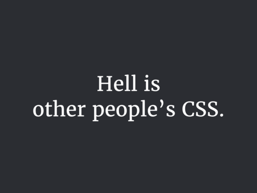
The problem
Let’s start with a story. You’re working on adding some
callout boxes to your client’s homepage. Since we’re
imagining things, let’s pretend you already have copy and
images.
So you sketch out a few potential arrangements of your content, and
pick some appropriate type styles based on your style guide.
Maybe you add the callout to a living style tile, so you can see how
it looks in static HTML, and everybody loves it. You have a nice
conceptual model of this feature that you can hold in your head, and a
handful of styles you can see on the screen all at once.
So you paste your markup into a template partial, and paste your CSS
into the existing stylesheet, and hit refresh, and
Everything’s busted. Why?
Rules from elsewhere in the site’s stylesheets are reaching
inside your little module and inflating your headline and unfloating
your image and generally undoing all your work.
In my experience, more than browsers mucking up the CSS spec, more
than the box model, more than SVG implementations, this is what makes
my job hard. And this is why we’re talking about specificity
today.
No matter how much you plan, the site will change in unexpected ways.
It’s inevitable, and it’s not a bad thing. A robust site,
a robust theme, a robust plugin handle change well.
Here are some examples of post-launch changes I’ve had to deal
with on WordPress sites in the past year. Remember, this was after we
thought we had everything figured out.
“It turns out some of these products have a subtitle with size
specifications that has to be shown with the title everywhere we use
it.”
“We’re pitching a client, and we need a custom page that
has most of our branding but no navigation.”
“For all of next month, we need a callout box to appear under
the title for every post in this section.”
Now, the nice thing about being comfy with a CMS like WordPress is
that you can think of quick solutions to these problems. But, still,
It never ends. Make sure you can handle it.
Too-specific CSS makes change hard.
How specificity works
Even if you haven’t thought about this in detail, you have a
feel for how it works.
When two rules apply to the same element, how does the browser decide
which wins? The simplified answer is the more specific one wins.
How does the browser decide which selector is more specific? There are
some tools to help you figure it out, like
Estelle Weyl’s SpeciFISHity chart, and
Keegan Street’s Specificity Calculator. They’re both good tools for building an intuition for
specificity.
But, basically, these are all the selectors, from least specific to
most:
| Universal selector |
* |
| Type selector |
a |
| Class selector |
.intro |
| Attributes selector |
[class^="grid-"] |
| Pseudo-class |
:nth-child |
| ID selector |
#search-form |
| Inline style |
|
First you have the universal selector, the least specific. Then the
type and class selectors, which are not surprising. Then the weird
cousins you forget about, the attributes and pseudo-classes, and the
ID, which beats everybody, and ratchets the specificity all the way
up, which is why most people avoid them for CSS altogether.
The inline style—styles in the style attribute
directly on an element—is the CSS version of sticking your
fingers in your ears and saying
LA LA LA I CAN’T HEAR YOU. Inline styles defeat
everything, which is part of the reason we hate them. Styles you apply
with JavaScript are inline styles.
And that’s it, really—
Oh yeah, except for that guy. You might think, well, if it gets that
hairy, I can just throw !important on there, right? If I
know I need my button’s margin to be at least this big, or my
whole plugin will be busted, I can just force
!important on there, and everything will always be fine,
right?
p {
  color: red !important;
}
Yeah, !important rules beat errrrrrbody. Well,
except…
p {
  color: red !important;
}

p.seriously {
  color: blue !important;
}
You know how they say the easiest way to drive down mountain
switchbacks at night is to turn off your headlights and follow the
stripe right in the middle? And hope nobody’s doing the same
thing in the other direction?
Well, !important declarations win out over everything
except other !important declarations, then
we’re back to the same rules as before. Important rules
don’t escape the model of specificity, they just increase the
value.
Specificity escalation
In the life of a site, the specificity of its CSS tends toward
infinity.
Hitting every branch
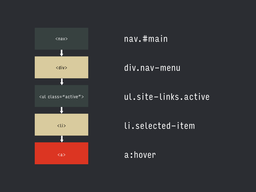
<nav id="main" class="main-nav">
  <div class="nav-menu">
    <ul class="site-links">
      <li><a href="#">Contact</a></li>
      <li><a href="#">About</a></li>
      <li class="selected-item">
        <a href="#">Store</a>
      </li>
    </ul>
  </div>
</nav>
I saw students in my introductory web class do this a lot: given some
markup like this, if they wanted to style that
selected-item link down there, they’d start like
this:
…start at the top of the DOM tree, then kinda
…jump off the top, and hit every branch on the way down.
nav#main div.nav-menu ul.site-links li.selected-item
It’s a misunderstanding of how the cascade works—you
don’t need those qualifiers or any of the elements in the
middle!—but it’s distressing how often you see production
code that looks like this. You never know, though, if the developer
was misunderstanding, or just trying to override somebody else’s
crazy selector.
Why not?
I mean, what’s wrong with that selector? It’s certainly
unambiguous, right? Come hell or high water, you’re going to
style that link.
If an existing style is overriding your new style, the only way to
defeat it (aside from deleting it altogether) is to make your new rule
more specific. It’s an arms race.
So if you take that selector we just saw, and, let’s say it’s
setting a line-height. If you need to override that line-height for
some versions of your nav links, there are two ways to go:
You can add an adjacent class on the node itself
nav#main div.nav-menu ul.site-links li.selected-item.has-icon
or you can add another wrapper around some part of it, and use that as
your specificity hook.
nav#main div.nav-menu .nav-with-icons ul.site-links li.selected-item
But what happens when that rule needs an exception?
The only way out is to get more specific.
Hard to reason about.
Instead of having a conceptual unit that’s composed of other
conceptual units, whose styles are more likely to live in one place,
you have a mishmash of things reaching beyond each other, and
it’s hard to think of them without also thinking of their entire
contextual universe.
In this case, my example was simple to fit on one slide, but usually,
the more you rely on the cascade for details within a module, the more
code you have to keep in your head when you think about that module,
code that might be spread all over the place. It’s much easier
to debug and simplify styles that you can see on the screen at once,
or at the very least in one screenful of Dev Tools sidebar.
Tied to a particular DOM structure
Taking our same example, if our DOM structure is on the left, with
that same selector broken into corresponding pieces on the right, this
is the “why bother if it works” state.
But let’s say you realize you’re going to have multiple nav
elements, and the thing you were calling #main is really
a header, so you change your markup…
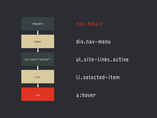
Oops. Your selector’s broken, and you have to go fix it.
Or, in our original structure, the list had an
active class that was applied when the user took a
specific action, let’s say opening a drawer. If your JavaScript
benefits from marking the parent div as active instead,
and you change your script…
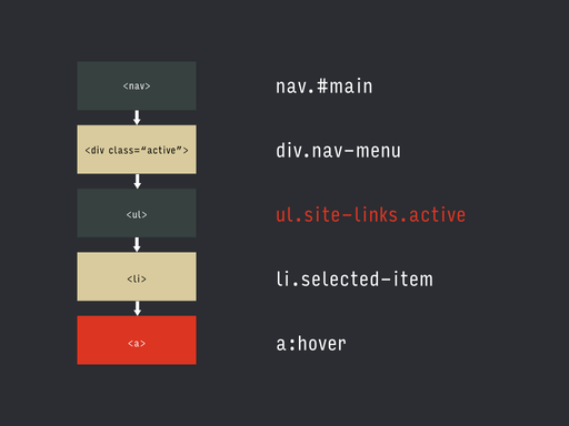
Oops. Your selector’s broken, and you’ll have to go fix it.
You want to have confidence in the changes you make. You want to be
sure that reasonable changes to your markup or your scripts
aren’t going to break other, unrelated stuff.
WordPress and specificity
These problems are particularly noticeable in the WordPress community.
I want to show you some examples I pulled from literally the first
three themes I chose at random from the wordpress.org directory and
ThemeForest. I’m not trying to shame the developers that wrote
these—we don’t know what constraints they were under, what
support ticket they were closing, or who else’s code they were
fighting.
.mean-container .mean-nav ul li li li li li a
That’s a really deep selector, right? I like this one because if
you read it aloud it kinda makes a song.
.sticky-enabled .navbar .nav li.dropdown.open.active > .dropdown-toggle
You read these right to left, so let’s see: we’re styling
the thing called “dropdown-toggle” when it’s the
direct child of the list item called “dropdown” and
“open” and “active” inside the thing called
“nav” inside the thing called “navbar” inside
the thing called “sticky-enabled”. This looks a little
like our “hitting every branch” example, doesn’t it?
It seems like .nav might always be inside
.nav-bar, so you could probably omit that selector…
unless you’re stuck in a specificity war.
#wpadminbar .ab-top-menu > li#wp-admin-bar-tc-customizr-help:hover > .ab-item
Two ids! They’re really serious about this one. Again, I’d
guess that #wp-admin-bar-tc-customizr-help is always
going to be inside #wpadminbar, and some of these
selectors are overly specific to fight other people’s CSS.
.mobile-menu-design-modern .header-social .alignright .fusion-social-links-header a
In this one, you can kinda do CSS forensics, and see where they
started and where things went sideways a bit. I’d be very
surprised if the initial selector included that
.alignright. More likely, there were styles for a general
case, and adding an .alignright wrapper somewhere had the
unintended side effect of breaking them, and this fix became
necessary.
Part of the reason we see these kinds of selectors in WordPress is
cultural norms and the way the old defaults behaved, and at least part
of it is due to architecture. Here’s what I mean by that:
Let’s say a given page template is made up of a bunch of
different partials, simplified here.

There’s kind of a natural inclination, when you know the
partials are going to change, to have each one identify its outermost
container with a class or id,
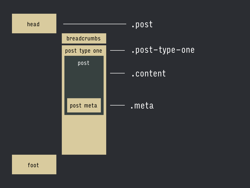
then turn those into a selector.
.post .post-type-one .content .meta {
  color: red;
}
Then, when one of the partials changes, you end up changing that piece
in the selector to match, if you want to style it differently.
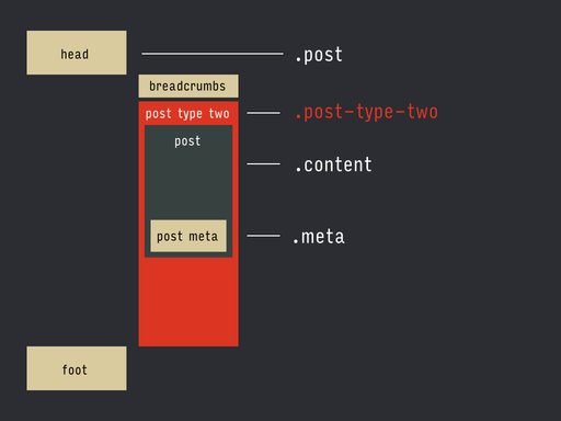
.post .post-type-one .content .meta {
  color: red;
}

.post .post-type-two .content .meta {
  color: blue;
}
So it’s easy to get into a pattern where you’re mirroring
the easy-to-change parts in your templates, and the nesting of your
templates, in your CSS selectors.
One one hand, it’s good. It’s easy to get up-and-running
on the PHP side. It’s an easy, built-in hook for style changes.
On the other, it’s not so good. You’re starting off with
crazy specificity.
How do we avoid all this?
Reduce unnecessary specificity.
Start simple, take baby steps
Start with the most brain-dead simple selector, and see what breaks.
If you’re starting a new stylesheet from scratch, you might be
fine (and also, lucky you). For instance, in our example, start by
trying the class on the node itself:
.selected-item

<nav id="main" class="main-nav">
  <div class="nav-menu">
    <ul class="site-links">
      <li><a href="#">Contact</a></li>
      <li><a href="#">About</a></li>
      <li class="selected-item">
        <a href="#">Store</a>
      </li>
    </ul>
  </div>
</nav>
If something does break, and it’s because of something higher up
in the stylesheet, resist the urge to go nuclear with your selector,
and take the smallest sensible step toward greater specificity.
Whichever conceptual unit you’re trying to style, try to move
one additional conceptual unit up on the hierarchy. Refresh, see
what’s still broken, repeat. A good candidate in the example
could be
.site-links .selected-item
since they’re really part of the same larger unit.
Now, one antipattern here would be to introduce a selector from an
ancestor that’s merely incidental, like
.grid-four or .alignright. Try to keep it to
selector that are really part of the larger context, rather than
things that just happen to be in the tree. Baby steps.
Don’t fear the markup
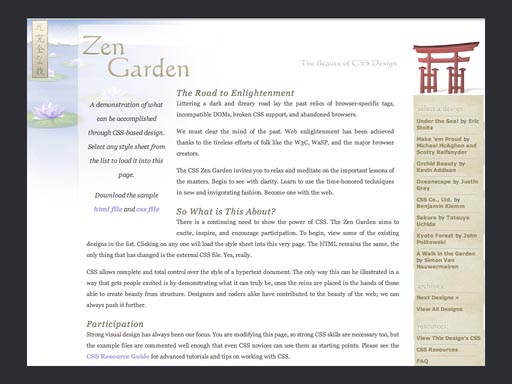
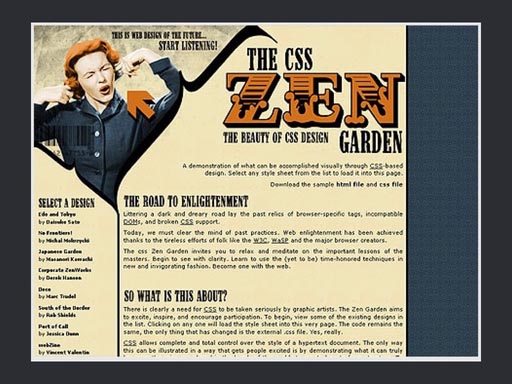
I think a lot of us were kinda broken by the CSS Zen Garden. If
you’re not familiar with it (and I guess it did relaunch a few
years ago, so it’s
still a thing), the idea was
that using this one page of standard markup, designers would submit
stylesheets that showed the power of CSS by drastically changing the
layout. For instance, this is the same page, same markup, different
stylesheet.
In a lot of ways, this set great examples, giving web designers a lot
of inspiration for interesting ways to use standard,
mostly-cross-browser CSS to do interesting things. In a way, though,
it set a bad example by teaching designers to contort their
stylesheets to jump through hoops without touching the HTML, and a lot
of people still do this.
It’s a really bad habit, especially if you’re
working with a CMS, where you can serve thousands of
“pages” from a handful of easily-editable templates!
<nav id="main" class="main-nav">
  <div class="nav-menu">
    <ul class="site-links">
      <li>
        <a class="site-link" href="#">Contact</a>
      </li>
      <li>
        <a class="site-link" href="#">About</a>
      </li>
      <li>
        <a class="site-link site-link-selected" href="#">
          Store
        </a>
      </li>
    </ul>
  </div>
</nav>
So get in there! Add helpful class names, create good names for
things. Add wrappers if they help, change the order pieces are nested
in. Help yourself out.
Some people get freaked out by defining pieces of a module with
multiple class names, for some reason. You see people bring up the
word semantic.
For years we were promised that if we were good, the browser fairies
would intelligently glean all sorts of metadata from our markup and
our classes, and synthesize whole new arrangements of data, and let
the user search… it’s never happened.
“Meaningful” class names are only useful as far as they
help you organize parts of your site into conceptual units. Classes
and stuff are there to help you. Well, unless you’re specifically
dealing with microformats, but that’s a different talk.
Don’t be afraid to change the markup if you can.
Use explicit server-side logic.
When you’re building your selectors like we saw before,
there’s an implicit logic behind what you’re trying to
select, and why. There’s a rule hiding in there, but you can
only make it out in the right context, by seeing the selector with the
other ones it’s trying to override.
Wow, you say, “If only there was some kind of language I use
could use to help me make decisions about processes programmatically!
Some kind of theoretical programming language!”
Instead of having your which-meta-thingie-are-these-selectors-styling
logic spread out in the structure and contrast of the selectors, get
that logic into a function and make it explicit to the next person
that comes along.
It’s at least one step closer to going from something like this
.post .post-type-one .content .meta {
  color: red;
}

.post .post-type-two .content .meta {
  color: blue;
}
to something like this (which, by the way, gives you the opportunity
to name things well):
.meta—warning {
  color: red;
}

.meta-subdued {
  color: blue;
}
Don’t accidentally the whole specificity
If you’re using preprocessors, it’s really easy to
accidentally introduce complexity.
I want to show you something I found on a project recently. A site
I’m working on was having seemingly random problems in older IE
(big surprise), and it turned out we were blowing through the budget
of 4096 selectors old IE let you have in a stylesheet. Even if
you’re concatenating all your stylesheets, that’s a
lot of selectors. So I copied out the generated CSS and took
a look in my editor, and this is what I saw.
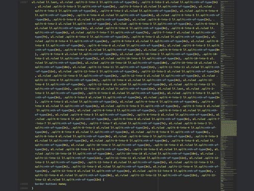
I tweeted this a few months ago, and you might have seen it. Terrible
and wonderful, right? Kinda awe-inspiring? My favorite part is when I
was scrolling down to this hunk, I could see this mass of text coming
up in the miniview like the boulder appearing behind Indiana Jones.
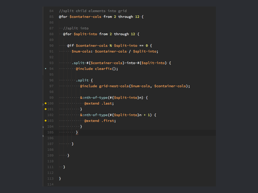
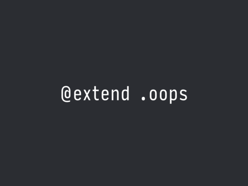
But what happened here was the grid framework included a SASS
@extend on the class .last, and that class
name got used elsewhere in the styles. Add a few mixins, and one line
of SASS has Sorcerer’s Apprenticed us to a stylesheet full of
brooms.
So be careful of these kinds of nightmare selectors. Check your
preprocessor’s output.
Strive for simplicity, as always
- Start simple, take baby steps.
- Don’t fear the markup.
- Use explicit server-side logic.
- Keep an eye on your preprocessor.
But most of all,
Thanks!
© 2015
Drew Bell